
Colour has the power to transform a collection from a group of individual patterns into a cohesive visual story.
It can help a collection feel intentional, professional, memorable, and emotionally engaging. Long before someone notices the motifs or studies the details of your artwork, they often respond to the colours first. Colour creates atmosphere. It communicates emotion. It helps establish the personality of both the collection and the designer behind it.
Perhaps that is why colour feels so personal.
The colours we are naturally drawn to often reveal something about our personality, our experiences, and the stories we want to tell through our work. Some designers gravitate toward bright, joyful palettes. Others prefer soft neutrals, earthy tones, dramatic darks, or vintage-inspired combinations.
There is no single correct approach.
What matters most is understanding how colour supports the story you are trying to tell.
Story First, Colour Second
One of the biggest mistakes many beginners make is choosing colours simply because they are trendy.
Trends certainly have their place, especially when designing for commercial markets. However, colour should always support the story of the collection rather than becoming a slave to trends that do not fit the theme or atmosphere you are trying to create.
Colour influences mood more than we often realise.
A collection filled with deep charcoals, rich burgundies, and dark greens creates a completely different emotional experience than one built around pale blues and soft creams. Neither is better. They simply tell different stories.
Consider how colour helps define the atmosphere of these collection themes:
- A soft botanical collection might use muted greens and dusty florals.
- A children’s collection may lean into brighter, playful colours.
- A coastal collection often feels at home with airy blues and sandy neutrals.
The same motifs could be used in each collection, yet the colour palette would dramatically change the story being told.
As designers, we carry the responsibility of being intentional with colour and understanding whether it supports the message and feeling we want our work to communicate.
Decide How You Want the Collection to Feel
Before selecting colours, it helps to ask yourself a simple question:
What do I want people to feel when they see this collection?
Do you want it to feel:
- Calm?
- Nostalgic?
- Joyful?
- Elegant?
- Cozy?
- Fresh?
- Sophisticated?
- Playful?
I remember starting out on my own surface pattern design journey and feeling completely confused about colour.
I deeply admired how established artists used colour. I could easily become inspired by all kinds of palettes and combinations. Yet whenever I tried applying those colours to my own work, something felt off. My designs didn’t feel refined, and they certainly didn’t feel like me.
Over time, I realised I needed to experiment.
I had to create collections, test colour palettes, place them onto products, and see how they felt in real-world applications. Some combinations looked beautiful but felt disconnected from my natural style. Others felt surprisingly comfortable and authentic.
One exercise that helped tremendously was collecting examples of artwork that inspired me specifically because of their colour palettes. Then I would ask myself:
Why do I like this?
What am I responding to?
Does this feel like me, or do I simply admire it in someone else’s work?
Sometimes I discovered I was simply appreciating another artist’s creativity. Other times I realised a bright palette appealed to me emotionally because I needed encouragement that day, but it didn’t necessarily fit the type of work I wanted to create.
Eventually, I recognised a pattern.
I naturally gravitate toward muted, warm colour palettes. Even when I create something joyful or bright, I still tend to soften the colours compared to what many other designers might choose.
And honestly, it feels like home.
Less Is Usually More
One lesson that continually shows up in my creative process is that limitations often create freedom.
I love working within constraints.
When building a collection, one of the most helpful constraints is using a limited colour palette.
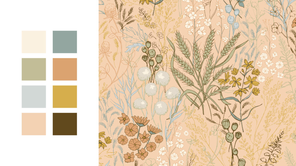
Depending on the size of the collection, I typically work with five to eight colours. Within that palette, I try to include a mix of:
- Light values
- Medium values
- Dark values
- An accent colour
Choosing the palette early helps guide many of my creative decisions.
Because I primarily work with vector graphics, I often build motifs using multiple layers. If I know my palette contains three shades of pink, for example, I can design a flower using those three values to create depth and detail.
Those simple boundaries actually help me become more creative.
Instead of endlessly choosing colours, I can focus on shape, form, composition, and storytelling.
The same flower would look completely different if I were intentionally designing it as a single-colour motif.
Limitations are not restrictions.
They are tools that help us create more cohesive work.
Finding Colour Inspiration
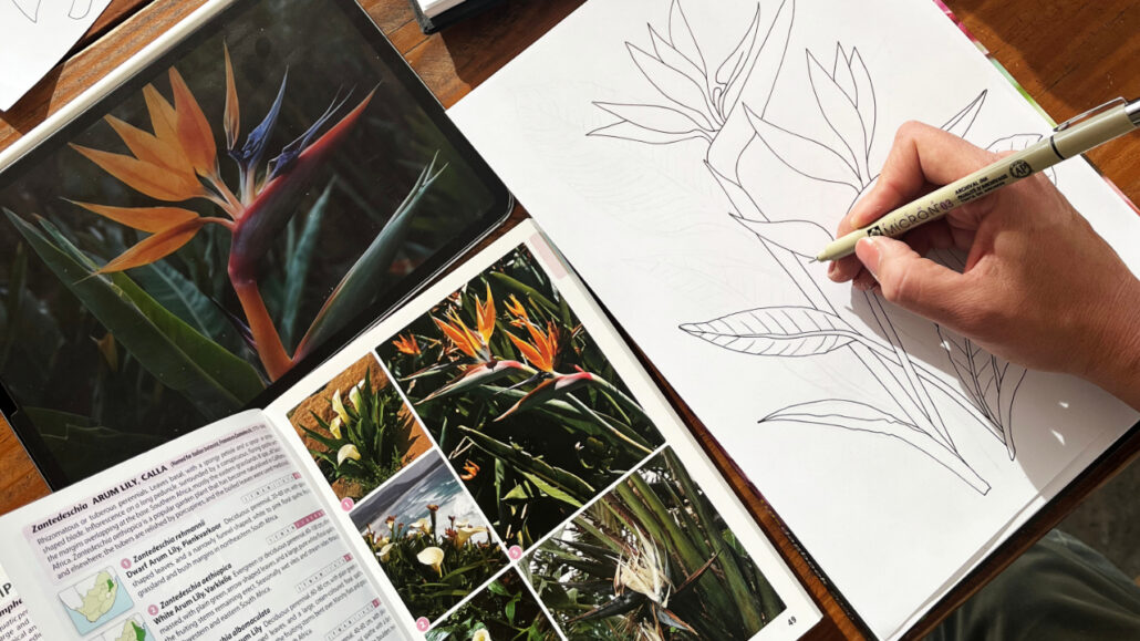
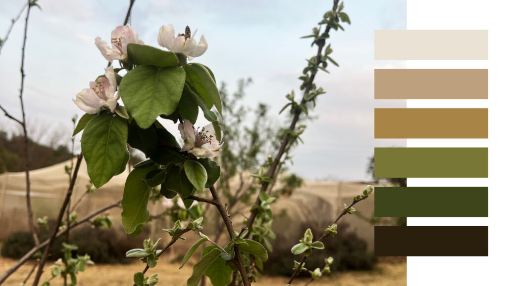
Whenever I need colour inspiration, I almost always begin with nature.
Some of my favourite colour palettes have come from simple moments during family walks. Sunlight filtering through leaves. Wildflowers growing beside a pathway. The soft colours of an early morning sky.
Nature rarely gets colour wrong.
I take photographs whenever something catches my attention and save them for future reference. Often, I return later and discover beautiful colour relationships I would never have intentionally planned myself.
Other excellent sources of inspiration include:
- Botanical gardens
- Vintage books
- Antique illustrations
- Fabric collections
- Paint chips
- Photographs
- Historical textiles
I also believe there is tremendous value in studying designers who consistently use colour well.
Observe their work.
Ask yourself why their palettes feel successful.
Look for patterns and recurring choices.
Building a personal colour library over time gives you a valuable resource to draw from whenever you begin a new collection.

Understanding Contrast
A beautiful colour palette still needs enough contrast to function well.
The amount of contrast required often depends on the intended application.
A wallpaper collection designed for a calm bedroom may benefit from softer transitions and less dramatic contrast. A quilting collection, however, often needs stronger value differences so individual fabrics remain visible when pieced together.
One common challenge I see among beginners is creating collections where everything sits within the same tonal range.
When all colours share similar values, patterns can feel flat and lifeless.
The motifs become difficult to read because they do not stand out clearly from their surroundings.
This is why it is important to consider:
- Light values
- Medium values
- Dark values
Contrast creates movement.
It helps the eye navigate the design.
It provides visual interest and prevents the collection from becoming monotonous.
Sometimes improving a collection is not about changing the colours themselves but simply adjusting the tonal values to create greater distinction between elements.
Permission to Edit Ruthlessly
Once your palette is established, step back and evaluate how well it is working.
My preferred approach is often to begin with a single photograph and use the eyedropper tool to select five to eight colours that naturally work together.
Then I test.
And tweak.
And test again.
As the collection develops, I continually ask:
- Does this colour support the story?
- Does it appear elsewhere in the collection?
- Is it helping create cohesion?
- Does it add value?
A strong collection behaves much like a family.
The colours belong together.
They share relationships and common characteristics while still bringing individual strengths to the group.
Not every colour deserves a place in the final palette.
If removing a colour strengthens the collection, remove it.
Editing is often what transforms a good palette into a great one.
Discovering Your Own Colour Voice
Some colours simply feel natural to us.
One of the easiest places to start discovering your colour preferences is by observing your everyday life.
Look at:
- The clothes you wear most often
- The decor choices in your home
- The artwork you save for inspiration
- The photographs you take
Patterns begin to emerge.
This doesn’t mean you must use the same colours forever.
You do not need one colour palette for your entire career.
Instead, try defining the kinds of stories you naturally enjoy telling as a designer. Understand your aesthetic preferences. Study other artists working within similar themes and learn from them.
Then continue growing and experimenting.
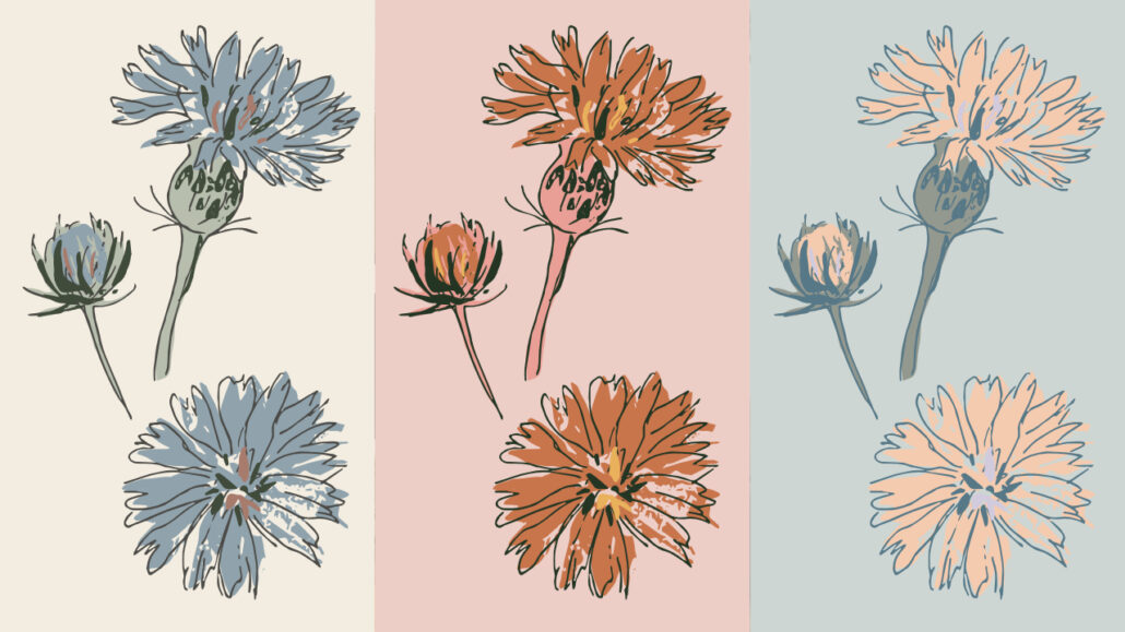
One of my favourite creative exercises has been taking a single collection and recolouring it multiple times.
The results were astonishing.
The motifs remained exactly the same, yet the entire story changed simply through colour.
That experience reminded me how powerful colour truly is.
It also makes me think about how uniquely God created each of us. We would never expect one flower to become another flower, or one bird to imitate every other species. Each was designed with its own beauty, purpose, and characteristics.
As creatives, we don’t need to force ourselves into someone else’s artistic identity either.
We can learn from others while still embracing the unique perspective God has given us.
Bringing It All Together
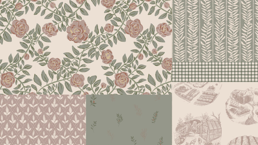
Colour is only one piece of the collection-building puzzle, but it is often the thread that helps everything feel connected.
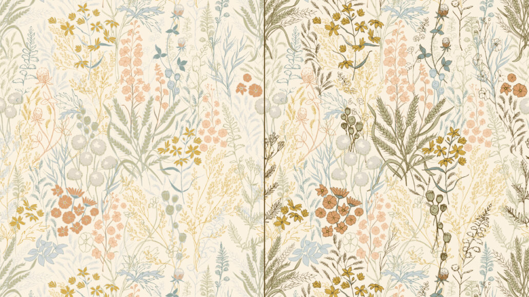
When colour, story, motifs, and purpose begin working together, a collection starts to feel less like individual patterns and more like a unified visual story.
If you are new to collection building, start simple.
Choose a story.
Gather inspiration.
Create a limited palette.
Experiment.
Refine.
And most importantly, keep paying attention to the colours that genuinely feel like you.
Over time, you will begin developing a colour voice that feels authentic, recognizable, and uniquely your own.
And that is often where truly memorable collections begin.
If you’re new to collection building, I recommend starting with my complete guide: Collection Building: The Art of Creating Cohesive Pattern Collections.